
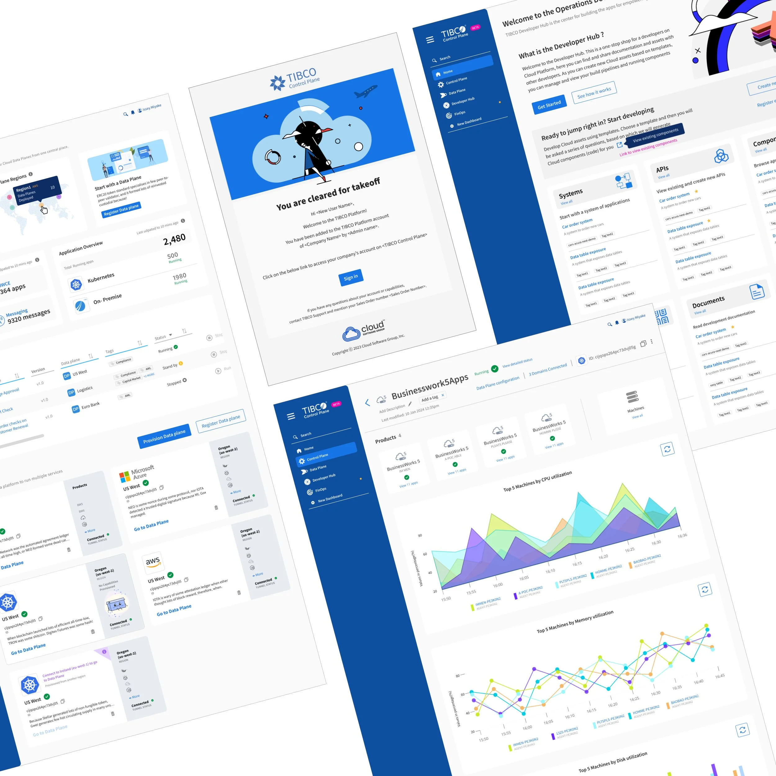
Digital Transformation to a Single Pane of Glass
This case study illustrates the move to a single SKU product offering.
Enterprise Software | Product design | UX/UI
I joined TIBCO in 2013 as a Sr. Visual Designer. In 2015, the Integration and Analytics product lines moved onto the cloud — and I ended up managing the team through that shift, doing Creative Director-level work well before the title officially caught up with it in 2019. That year, the company needed something bigger: a full transformation and consolidation across the product portfolio, driven by a real business problem — too many disconnected products, too many SKUs, and a fragmented experience for customers trying to use them together. The mandate came straight from the top; our CEO put it simply: build a single pane of glass. My team was tasked with making that real — unifying the UX and bridging functionality across product lines that had never been designed to work as one.
Challenge
The complexity of scale of the platform led us to one solution - a schema approach to mapping out the mental model for the interactions. While common patterns like integration, configuration, deployment, and monitoring stood as foundational models we simply could not predict all the use cases to which the user engaged with the services.
method
Team contributors: Engineering Leads | Product Managers | Designers | Users & volunteer testers
My role & contribution: Art Direction | Leadership | UI Design & Design System
Roles
Architecture for 2nd digital transformation

Start at the Summit
Every app on the platform possessed its own unique features uncommon to each other but when integrated and collectively folded into a platform proved to be a formidable solution for enterprise companies.
My problem to solve was to assess each product roadmap to:
determine schemas for ux patterns,
derive the features applicable to known use cases
draft wireframes and scope effort to cost out design support.
Focus on the User
The team created qualitative personas based on interviews, and observations. My role was to administer the process -- facilitate the sourcing of key individuals in the company and externally using UserZoom, participate with interviews and observations, and get sign off from the stakeholders on the work.
Each persona has core needs and pain points. These help to inform us in the design yet they were evolving due to paradigm shift of cross functionality in the Control Plane. For example, Ian the integrator's "Needs" is to collaborate on his API models. With cross functions in the Control Plane Ian could not only collaborate, but operate and develop one as well.

OMAR - the operator
Needs
Keeps the environment in optimum performance and efficiently running
Needs to monitor systems without writing code.
Needs to be able to troubleshoot the issue and resolve quickly
Pain Points
He wants to automate actions to repeat and scale
Monitors systems trouble shoots all the time
Reports and status updates

IAN - the integrator
Needs
Needs to connect systems without writing code
Needs to collaborate on his API Models
Wants to write a service once and configure it later
Needs to deploy technology into ecosystems (into the external website - analytics, a/b testing, personalization
Pain Points
Integrating the data sources from different systems
Working with companies with 24+ different apps for most organizations
Provisioning environments

DENI - the developer
Needs
Being able to keep to roadmap of projects / functionality
Architect scalable solutions across the organization
Needs to deploy technology into ecosystems (into the external website - analytics, a/b testing, personalization
Pain Points
Delivering projects on time, on budget
Scope creep from changing requirements
Data Governance
Validation and Production (Iteration)
From the users needs, we began to draft sketches of the dashboard UI. Based on the use cases, I lead the designers to create design options for the Key features of the platform:
Provisioning
Management
Observability
Utilizations
Monitoring
To validate these patterns, my team conducted usability testing with representative users to ensure the framework addressed their needs effectively. Their feedback helped us refine the interactions and prioritize features.
As a result, the validated designs were then transitioned into production through close collaboration with engineering, ensuring that the patterns maintained their functionality and usability at scale.
A/B Testing / Variables
The A/B testing on the card component also surprised us.
Option A aesthetically scored well for the composition and simplicity yet Option B scored well for functionality, and readability. The trade offs in the design meant the consistency would be affected.
Moreover, the variables for location, and empty states, added extra complexity to the design states.

Option A - Services
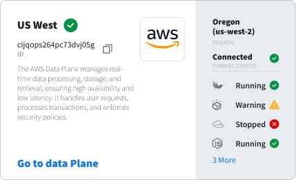
Option B - Geography and status

Variables - Region switching
Variables - Empty states
The Impact
A schema-based configuration model was introduced to align with users’ existing mental models of system setup. Usability testing results showed:
Task completion rates improved by 26%, as users could predict and locate actions more intuitively.
Time on task decreased by 37%, indicating a more efficient, expectation-aligned UI.
User error rates dropped by 41%, demonstrating that the structured schema reduced confusion in workflows.
Support tickets related to navigation decreased by 30%, reinforcing that users adapted quickly to the new structure.
Streamlining navigation reduced clicks needed to access key features by 40%, making the experience more seamless
The designed dashboard reduced the average task completion time from 12 minutes to 6 minutes, improving operational efficiency by 50%.
Launched 3 pillars to the Cloud Platform
Control Plane
Data Plane
Developer Hub
Design System for the Control Plane
Reflections
Five years of that work taught me how directly interface clarity feeds customer trust — especially on a mandate as sprawling as unifying years of separately-built products into one coherent experience. When a technical product stops fighting the person using it, that shows up as people staying longer, adopting more of the platform, and speaking well of it to peers, the kind of goodwill no single metric fully captures. I'm proud of the design culture our team built around that belief, and grateful for the chance to lead people who cared as much about the customer's experience as I did.